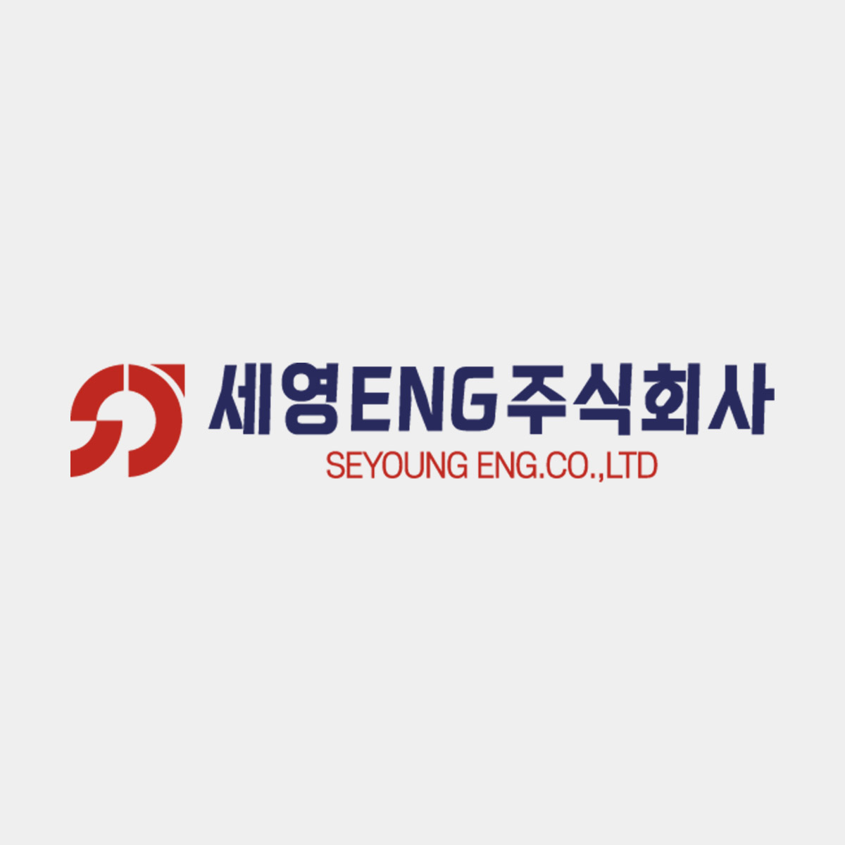
SEYOUNG ENG. CO., LTD.’s corporate identity symbolizes the company’s core expertise in ship piping systems, visually expressing precision and trust as the foundation of its brand image.
The red symbol represents a stylized pipeline through which fluid flows, embodying the dynamic and flexible nature of SEYOUNG ENG. CO., LTD.’s marine piping systems.
The bold red color conveys passion for technology, energetic innovation, and a strong commitment to safety and quality.
The Korean logotype, “세영ENG 주식회사,” is rendered in a clean and solid gothic font, highlighting the company’s professionalism and reliability.
Its blue hue evokes the sea and the shipbuilding industry, symbolizing continuous growth and challenges within the expanding marine sector.
The English logotype at the bottom reflects SEYOUNG ENG. CO., LTD.’s vision for global markets and its commitment to international competitiveness.
The use of red maintains visual consistency with the symbol while leaving a bold and lasting impression.